How to Wow People with Your PowerPoint
Four tips to spice up your next slide deck presentation

In her role, Sarah Hamblet studies visitor experience and behavior on the Duke Health website. It’s her job as a senior planning analyst for the Duke Health System to translate data into easy-to-understand PowerPoint presentations for colleagues.
Her rule of thumb: stick to a visual template, don't overload slides with information and ensure text is large enough to see.
“The data is useless if people don’t understand it,” Hamblet said. “If you start throwing a bunch of numbers and tables at people without explanation and context, they’re not going to understand it.
Many colleagues regularly prepare PowerPoint presentations, but for some employees, the journey with PowerPoint may be just beginning. We asked around for tips to turn blank slides into interesting and readable visuals.
Use a consistent theme

Picking a visual theme is the first step for Kyle Fox when it comes to creating a PowerPoint. A theme provides a predefined layout and set of colors, fonts and effects to apply to the slide presentation.
Fox, director of creative services for University Center Activities & Events, said themes are important because they keep slides legible and consistent.
PowerPoint comes with a selection of pre-made themes available in the “Design” tab. The Duke Communicator Toolkit has free Duke branded slides available here. The Duke Health Brand Center has PowerPoint slides here. You can also consider other templates that are available through a simple Google search.
“We’re asking people to look at a presenter, listen to them and see a presentation behind them,” Fox said. “If you’re changing up the look for each slide, that’s going to distract from whatever the messaging is.”
Keep each slide simple

Sarah Hamblet always creates two versions of the same presentation.
She sends a PDF version, which is loaded with text, data tables and graphics, to colleagues after the presentation. This gives Hamblet’s colleagues a resource when they need data or context about her presentation in the future.
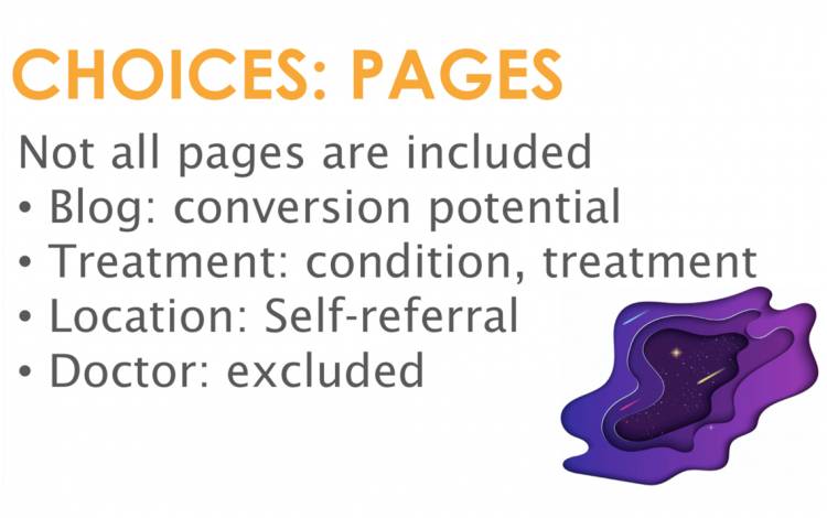
The other version for the presentation features half the information. Hamblet sticks to one message per slide with no more than five lines of text and two images on each slide.
“I start looking at my original creation and ask myself, ‘What’s the point?’ she said. “People won’t know what to focus on if I have a bunch of different messaging on one slide.”
Joy Birmingham, assistant director of leadership and professional development for Duke’s Learning & Organization Development (L&OD), said too much information and too many visuals on one slide are overwhelming for viewers.
“If you make your listener choose between listening to you or reading a busy slide, they will pick the latter,” she said. “Keep your design simple, consistent and legible.”
Ensure text is large enough to see

Kyle Fox asks a coworker to view his PowerPoint from 5 feet from a computer screen. He wants to know if the text font and color are legible for a viewer in an audience.
“Think about how people are going to be looking at your presentation,” Fox said. “Their faces aren’t going to be pressed up against the screen. They might be 10 or 20 feet away.”
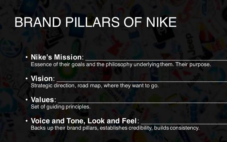
He recommends using a sans serif font, which does not have small lines or strokes attached to the ends of the letter. As for color, pick a shade of text that is in high contrast to your background. A bright font should be used with a dark background and vice versa.
Visit brand.duke.edu for a list of official Duke typefaces and colors.
Include a wrap-up slide

A staple of Blyth Morrell’s PowerPoint presentations is a wrap-up slide.
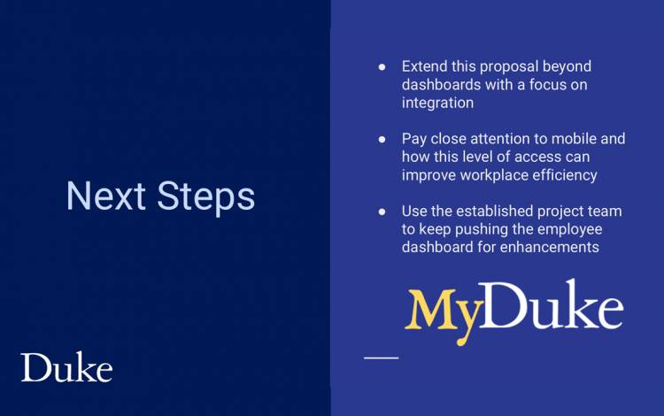
She finishes every PowerPoint with two to three major takeaways, discussion questions or next steps to summarize her presentation.
“You want to leave your audience with something to remember,” said Morrell, director of digital communications and strategy for University Communications. “It’s a final opportunity to have the audience follow your call to action or remember your major talking points.”
For additional tips, see here.
Have a story idea or news to share? Share it with Working@Duke